Showing posts with label Kitchens. Show all posts
Wednesday, November 13, 2013

A Week In Weston - Kitchen Reveal

Sometimes, all a kitchen that's been beat down and broken needs is some good old fashioned love and affection. Thanks to some of said affection, our client Sam - a lawyer/culinary school attendee - now cooks in this kitchen. But let's see how far this kitchen has come.
 
I know. It's a sea of oak cabinets with my favorite design pet peeve - fake plants! The good news? The cabinets are solid wood and were in excellent condition. Since a gut job was not in the budget, this was great news. It meant that all we needed to do was paint the cabinets and add some hardware. The appliances were all stainless steel and relatively new so again, great news.

Fresh white paint on the cabinets, would make for a great contrast against the new dark hardwood floors. We added a small overhang to the island so Emerson and Noa could sit close-by to help Sam as he whips up a favorite meal. 

We replaced the old countertops with granite, and added subway tiles as the new backsplash. We wanted some fancier cabinet handles, but they were insanely pricey and in the end these simple and classic ones proved equally fab at a fraction of the cost.


We reused the faucet but updated the sink.

And added roman shades to the windows in this sunny yellow fabric.


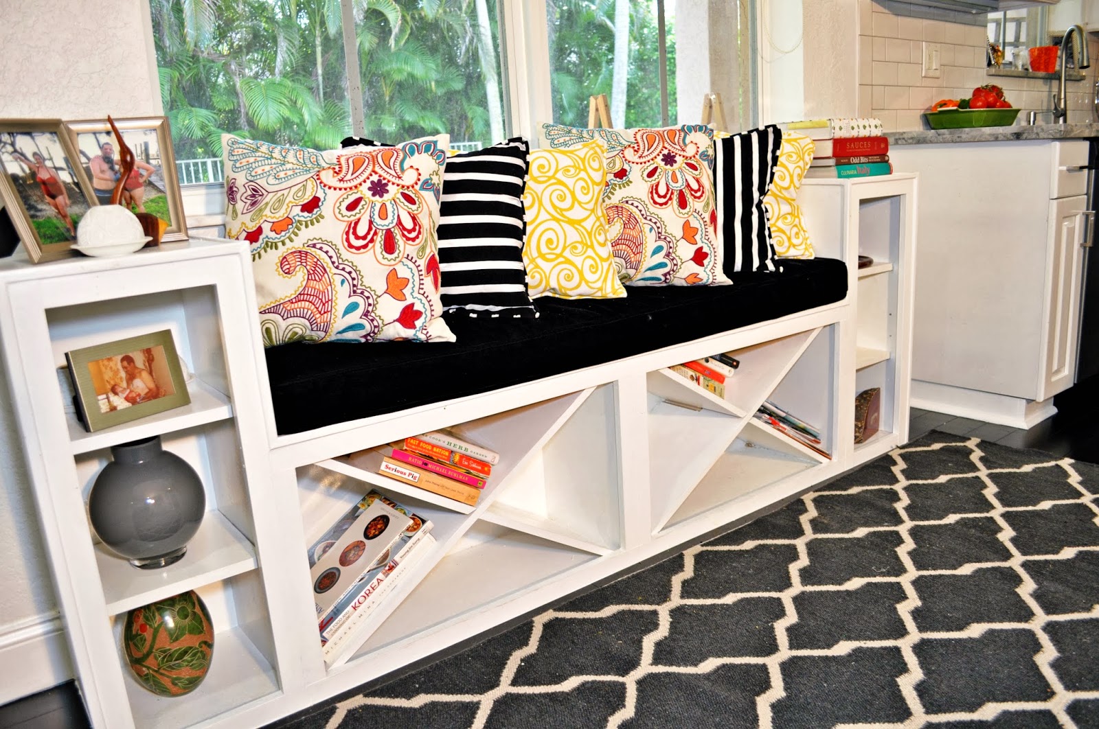
One of the must-haves for the kitchen was a banquette area. Sam and Athalia fell in love with this one we built for the fab Ms. Jina B., and so of course Shaggy went to work customizing one to best fit the space.   

 The entire family now chills here on a regular basis. This banquette needed lots of storage for Sam's massive collection of cookbooks - over a 100 books are stored between here and the adjacent family room. 


The open shelving also boasts family mementos and photos. Athalia also wanted a mix of fun throw pillows so we grounded that with a black cushion. 


Fun wire-legged chairs are a great seating option for kids since they handle spills and crayon marks really well i.e. easily wiped off. Like the dining table, we are planning to add glass to the top of this table to protect for wear and tear i.e. spills and crayons!


Two of these hinged pendants added just the modern lighting we needed in to vanquish the memory of the past fixture. Whew. A LOT has changed in this kitchen, and nary a jack hammer in sight. Have you painted kitchen cabinets are you on team gut everything and start over? Do tell. 


PS. Happy anniversary to my amazing hubby. Three years later and he still makes me laugh out loud, all the time. Thanks for being my rock, my comedian and the best baby-daddy a girl could ask for.  


                                            Source Guide
Pendants Lights - Lumens.com
Wire Base Chairs - Overstock
Metal Stools - Overstock
Granite - Panda Kitchen and Bath
Subway Tile Backsplash -  Home Depot
Roman Shades fabric - Designer discount fabric
Banquette -  Custom design by Circle Ten Maintenancefor Nicole White Designs.
Tuesday, October 22, 2013

Bachelor Pad - Part Two Kitchen

So what do you think happened once we transformed our bachelor's living room from frumpy to swanky? 
The kitchen, with it's all white everything - walls, ceiling, cabinets and appliances - became a glaring eye sore. Our original plan was to wait a few months to tackle this space but Mr. Bachelor had been bitten by the design bug. No, no, no, he said, let's just tackle it now. Alrighty then sir. Let's do this I said. This is where we started: 

 
There was no budget for a major gut job, and as much as I love to rip things out to renovate kitchens, there was no need for that here. The white cabinets were in great shape and just needed some sexier companions. 
The existing cabinet handles were too small, so new handles were a quick fix.  Since he's rarely home, it means he rarely cooks and so there were some empty cabinets that we decided to convert into wine racks.


Because seriously people, propping a wine rack atop a random table in your living room does not a bar cart make. We clearly needed a solution and thank goodness we found one.


The fabulous Shaggy again worked his magic as he did here for our bachelorette Jina - hmm, should these two meet? We removed the cabinet doors on either side of the microwave, and installed wine lattice to create the racks, which now fits over 30 bottles. Partyyyyy...To further soften up all the white, we painted the ceiling in this color and replaced that pesky white light fixture with six recessed lights - on dimmers of course. Lighting my peeps, is the key to great design. Always, always splurge a little, if you can, to upgrade your lights and place them on dimmers to control the mood.

Hello eating area. Thanks to the mammoth loveseat that once suffocated this area, Mr. Bachelor had never once eaten a meal at this area. It had simply become a place to stash mail and other chotskies but no more. Let the fine dining begin, while seated atop these new white leather bar stools

With a new place to sit, eat and entertain, the sink and leaky faucet became another eye sore. *Sidenote: why do I always forgot to remove my purse/suitcase from these before pictures??? Lord help me.

We updated the sink and faucet with a modern double sink and a very sleek faucet.


Before this transformation, he had no idea what a backsplash was. He's now a huge fan of this simple upgrade of a glass tile backsplash. We did splurge a bit on these new appliances and included a double oven (I love these new options) since the smaller oven was a great way to prepare a quick meal aka a pizza, and free up much needed space on the counter top for the important things like a Keurig coffee maker.

 That's all folks. A somewhat brand new kitchen for our favorite bachelor.


Thursday we'll step outside and check out to his new balcony, which is now kind of a fab space to chill and enjoy these cool Miami nights.  


Tuesday, October 15, 2013

Bachelor Pad Makeover - Part 1

One of the most fun projects we've done this year, has been the bachelor pad makeover for our amazing client, Al. More than any other makeover, this one has developed quite an Instagram fan club. I cannot tell you how may IG messages, emails and texts I get each week about the status of this reveal. Hmmm, I wonder if it has something to do with his bachelor status?
Anyway, back to the lesson at hand.
I met Al last year when I redesigned his office. He was so impressed that he promised to call when it was time to revamp his condo.
We finally caught up over the summer and he decided it was time to take the plunge to make his home as swanky as his office. And boy was it a doozy.
Al is a client who has become a dear friend, so our conversations are pretty frank and I think I said something along these lines when I first saw the condo: "No sir. No respectable Miami attorney should be living like this."
He'd purchased the condo a few years ago and then did what most bachelors do - went shopping and just purchased a bunch of furniture - good pieces though from Pottery Barn - without any rhyme or reason.

As you can see, the pieces were too bulky for this small space and did nothing to reflect his personality - his love of New York, Beirut, London, tennis and most important, Jay-Z.
We started with this design inspiration. 

I knew a sectional was the best way to utilize the space and to create maximum seating, while allowing for easier access to the bar/breakfast area, something he couldn't even access thanks to the bulky sofa.


This sectional, from Crate and Barrel, was the first one we tested on our shopping excursion and it was so comfy, that every other sectional paled in comparison. Notice that it is not leather. There is an assumption that men need or prefer leather seating and that was definitely was not the case for our bachelor.  
I also wanted to use wallpaper on the focal wall. This bold, yet smoky grey striped paper from Graham and Brown, reminded me of a man's suit so I was happy when he agreed to it. I've been smitten with the HGTV collection of paints from Sherwin Williams and though Al doubtful that the colors I suggested were too dark and would make the space feel small, he trusted my instincts and gave the go ahead to use two colors throughout the main areas - Mink and Expressive Plum.
The artwork was selected to reflect his heritage and favorite cities. Al was born in England (center photo of the famous cathedral in Exeter), to a British mom, his dad is from Beirut (photos above that amazing floor lamp from Modani) and he loves New York so much we had to have two photos. 


Although we had pitched some rustic elements in the initial presentation - i.e. the coffee table and bar stools, we decided to go for a completely contemporary look and settled on a much some sleeker coffee table and bar stools.
When designing a small space, I always look for ways to maximize storage and seating. This coffee table came with an ottoman that he can rest his feet on as he watches tennis or his new favorite addiction, Flipping Out. It can also be pulled out completely and used as seating for extra guests. The white end tables are also stools and again, can be used as extra seating when he entertains.
If you're followed me for a while, you may have noticed that I love to layer my table tops with trays as they serve as functional pieces for eating, and as a place to anchor a cluster of decorative items. I settled on the pattern play of the rug, scored at Overstock and mix of pillows from West Elm and CB2 because they reminded me of the fun pieces who could pair with a stylish suit aka our striped wallpaper.
The media unit and television area were a mess of wires, a TV hung way too low, speakers jutting out from the wall and dumb bells - because every single guy thinks dumb bells are decorative items.


No man's castle is complete without a well functioning and organized media center and television. We removed the unsightly speakers, and instead purchased smaller speakers that give off so much sound you'd think you're at the movies. How small? You can barely see them atop this console. This is a small wall just 60 inches, and it wasn't easy to find a low media console to fit the space. I eventually found one at Antonini Modern Living and loved it because the wooden portion can slide out to make it even larger should he one day move to larger space. In lieu of a plant, I added a bit of greenery with a collection of his tennis balls.  But the thing he the loves the most about this area, is that image of Jay-Z. The personalized hand-drawn image was made by this Etsy artist, who used the lyrics of two of his favorite Jay-Z songs, "Empire State of Mind" and "Forever Young". Nothing beats a personal touch in a space, and that was by far one of our favorite finds for this projects.
With no formal entryway, or space for a console table for keys, mail and nicknacks, a floating shelf was the best solution for both style and function. We topped it off with a duo of mirrors with leather straps from Target, for that masculine touch and capped it off with a mantra from who else? Jay-Z.


Photos as always, by Circle Ten Media
There you have it. The space he now calls home. I have received some of the most expressive emails of gratitude I've ever received from a client, from Al, who remains in awe every time he returns from a long business trip and steps inside his once unassuming condo. This photo gives a hint that there were some changes made to the balcony, and the kitchen and I'll reveal those changes in later posts, including some details on all the lighting upgrades we made - there were no lights at all in his living room or master bedroom. Stay tuned. 
Thanks as always to the team who rocked this one out. Thanks too to all the Instagram followers who made this one a fun project to share each day.
Apologies that you had to wait so long for the reveal, but there are often delivery delays and so many other behind the scenes stuff at play - like remembering all these details/anecdotes for a blog post- that a reveal can take some time. I hope, it was worth the wait. Holla back. Do you have a favorite area/item?   
Wednesday, September 11, 2013

A Bright and Fun Kitchen Reveal


I received a call late last year from a friend of this amazing client, and the conversation went a little something like this:  
"Hi Nicole, my name is Dr. Cobb. You don't know me, but I saw what you did with Debbie's kitchen. I remember that original kitchen very well, and if you could do that, to that kitchen then I need you in my life!"
Well, of course we had to meet. She was even more charming and welcoming in person, and so began our journey of many, many months to transform her kitchen, truly the heart of her home. 
Dr. Cobb aka Ms. Barbara, a retired elementary school assistant principal, is a serious cook. For 28 years she'd thrown down some serious meals in a space she'd never really been happy with. It was functional for sure, but said nothing of her sunny and bubbly personality so I knew that had to change.
Since y'all know I love knocking down walls, as evidenced in many of our previous kitchen renovations, we first considered removing the wall dividing the kitchen from the dining room to open the space tremendously. 
But it would mean a clear line of sight into the kitchen once you opened her front door and after many revisions, and sensing that she simply was not comfortable with such an open concept, we decided to leave the blueprint as is. Here's how we started:


Dropped ceilings, outdated cabinets, laminate counter tops, linoleum floors, the list goes on and on. The first order of business of course was to demo everything and start over. The first rule of thumb of any kitchen design is to maximize storage, so taking the cabinets all the way to the ceiling from 30" cabinets to 42" cabinets was a must. That alone pretty much doubled her storage, and allowed her to bring in items that had been in storage in her garage.
A birds eye view of the sink area. 
As you can see, we went with a very similar cabinet color except these are solid wood and offer much more storage via Lazy Suzanne's and more much organized drawers and cabinets. 
Once we agreed on our cabinet finish, we went shopping for our tiles and we both fell in love with this Manhattan porcelain tile from my go-to tile store, Floor and Decor. It is a stunning, yet detailed tile so we had to be careful to select a counter top and back splash that could work in harmony.


You'll notice a flood of lighting in this space, far cry from the dull glow she had from the fluorescent lights under that dropped ceiling. I go heavy on lights on my renovation projects because I cannot emphasize enough how critical good lighting is. Here we installed recessed cans, under cabinet , lights over the sink and LED strips in the pantry. 


I fell in love with that fabric used for the window treatment on one of my many trips to my favorite fabric store, Designer Discount Fabric. I knew right away it was a winner and didn't even offer a Plan B. The minute I showed it to Ms. Barbara she fell in love as well. 


Ms. Barbara shops a LOT so she needed a refrigerator that could handle her penchant for stocking up on food items. This was a second model. The first we selected was not deep enough and thankfully the good people at the Home Depot were willing to switch it out weeks later. 


One of the main reasons for keeping the layout in tact as well, was this gas range. Relocating a gas line can be a costly endeavor so keeping the new cook top in this space just made sense, though clearly she now has a more swanky cook top with six burners to boot and a new microwave overhead, again freeing up valuable counter top space.  


Just some of the things that make her happy, including a few books from her vast collection of cook books. We first revealed this stunning Brizo faucet we purchased from Ferguson over on Instagram. It's a far cry from the original faucet.  

 
We saved a lot of money by not doing custom cabinets, but even stocked cabinets can be customized. The very talented Roy, who took the lead on this project, turned this end cabinet into a display area for her spices. 


The gallery wall is both functional and personal. A much needed cork board holds her everyday to-do list, recipes and coupons and also hides the unsightly electrical panel. Keep in mind that that cork board can be easily removed for quick access to the panel, as is required by the code. Photos of her 4 year-old grandson Jeremiah - an avid reader - and that kitty artwork is my nod to her beloved cat Trixy, who tolerated us throughout this renovation. 


As always,all photos were taken by the amazing Shaggy of Circle Ten Media
The lady herself, radiant about her kitchen and beaming because she thinks she has a chance at winning our upcoming oxtail cook-off. I'm kinda known for that and my mean pot of stew peas Ms. Barbara, so I hope you're prepared to lose, in your very own kitchen to boot. See you soon and thanks again for allowing us to transform your kitchen into the space of your dreams and for being so patient, warm and welcoming to the entire team. 
P.S. You can see many more before and after shots over on our Facebook page. 
P.P.S. Happy Hump Day everyone!
P.P.P.S Happy birthday to my amazing husband, Patrick and a solemn moment of silence for all those who perished in the 9/11 attacks, including my dear friend Michael.